upspring
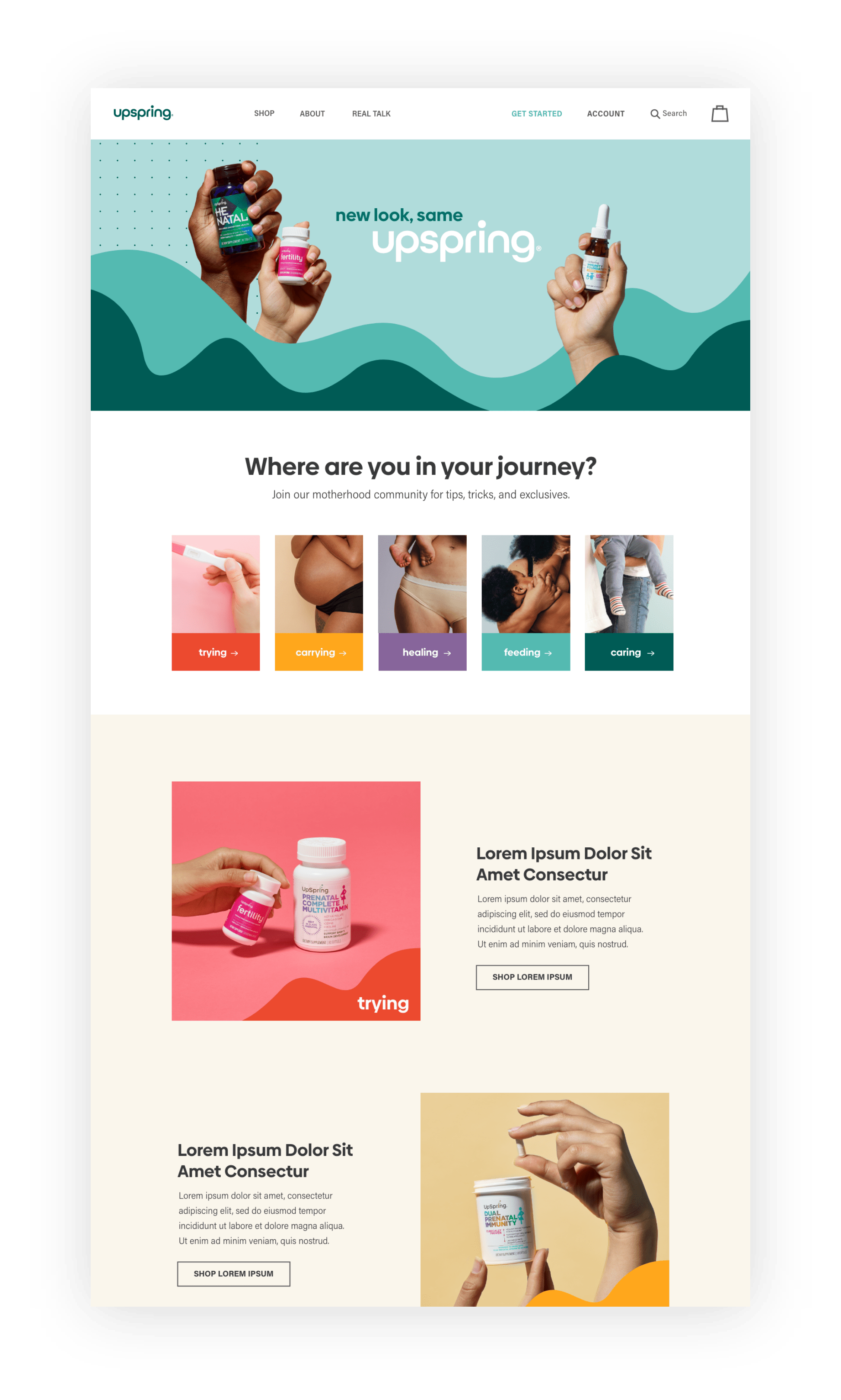
A global women’s health consumer brand was in need of a brand refresh. I helped lead an evolutionary approach to update their existing logotype. We rounded out their letterforms to emphasize the curves of motherhood. The “U” in the name Upspring, became an established visual mark, which we also wove into the brand voice. We renamed the categories of products to convey the journey of motherhood: trying, carrying, healing, feeding, and caring. The “wave” visual became a visual representation of the highs and lows of every mother’s story.
Brand Identity
Web Design
Digital & Social Assets


